Folks,
I am a global warming skeptic. This term, however, requires some explanation. I believe in climate change. The climate is always changing. However, I don’t think it is clear that the world has been getting warmer in the last decade. I also am not convinced that humans are the main drivers of whatever climate change has occurred. The following explains why.
Point 1: For the Last 12 years the World Not Getting Warmer
The global warming scenario that exists today is that human emissions of carbon dioxide are the main reason that the climate is warming. So, it is natural then to ask, is the climate really warming? One look at USA Today’s cover story “Why You Should Sweat Climate Change” on 1 March 2013 would appear to settle the story. Just look at Figure 1 below.
Figure 1. Graph from USA Today Cover Story March 1,2013.
A quick scan of the graph shows 55.34°F last year and 50.56°F in 1895. A 5 degree increase. Wow! A little closer analysis reveals that these temperatures are individual data points. If you look at the years 1900 and 2010, you get 53°F for both years, essentially no change. The thick red line is the long term trend and admittedly it increases from about 51.3°F to about 53°F in the 117 year period.
Note the icon in the upper right corner, it shows the globe with a dramatic upward trend line. However, this causes you to now note that this graph is for US temperatures, not world temperatures. What was the world temperature like? As this thought crosses your mind, you remember that 2012 brought Europe its coldest winter in recent memory. So you go on the internet and find out that 2012, for the world, was the ninth hottest year on record. Scary. But then you think, “Wait a minute, that means that eight years were hotter.” So you wonder, what do the last 10 or so years look like for world temperatures. The graph is below in Figure 2:
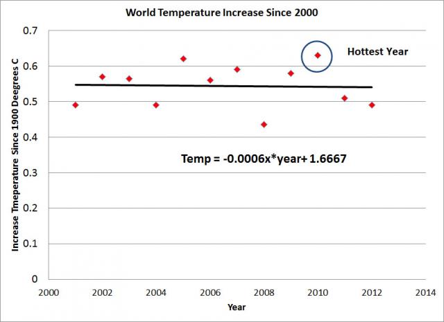
Figure 2. World Temperature 2001-2012. Graphed by Dr. Ron
Note that for the last twelve years, the trend is flat (actually a little down). Where are all of the headlines sharing this important information? So it is not clear that the world is continuing to get warmer.
Am I the only one that finds it troubling that the media seem to universally tout the scary stories about global warming, but don’t seem to mention obvious counterpoints such as the graph above? This information is profoundly important.
Point 2: In the Past, Nature Along has Delivered Stunning Climate Change by Itself
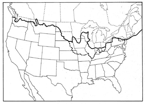
I am writing this post from my home Woodstock, VT. I look out my window and view two beautiful, large rocks, each about the size of a house. These monoliths were likely left as the glaciers in the last ice age retreated, these rocks probably originated in Quebec. Woodstock was under thousands of feet of ice during the last ice age, Canada was completely under ice. New York State’s Long Island is a glacial terminal moraine. The extent of the ice coverage is shown in Figure 3 below. However, the forces of nature alone, raised the temperature of the earth by 12 degrees Celsius (with no help from mankind), melting the glaciers and allowing me to live in the Green Mountain State (Vermont = Ver (green) mont = mountain, in French.)
Figure 3. The Extent of the Ice Coverage in the Last Ice Age http://www.iceagenow.com/
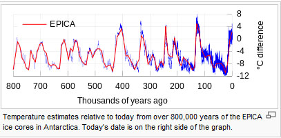
The natural processes that caused the warming are many. They include the precession of the earth on its axis, variation in the output of the sun, changes in the ocean and atmosphere, and others. These processes have resulted in the past temperature changes as shown in the Figure 4 below.
Figure 4. Temperature of the Earth in the Past 800,000 Years.
This figure shows as much as a 20°C (36°F!) temperature swing produced by nature alone. The change in world temperature between 1900 and 2010 would be about as thick as the line in this figure.
I find the proposition that the main driving force in global warming (if it is occurring) being human produced CO2 alone is hard to accept, when we see what mother nature has given us in the past. It would be similar to someone taking the position that the only thing that affects stencil printing quality is the stencil. When others point out that it might be the solder paste, or the print head, or separation speed, etc., they are shouted down as being unscientific.
Point 3: It was Warmer in the Middle Ages than Today
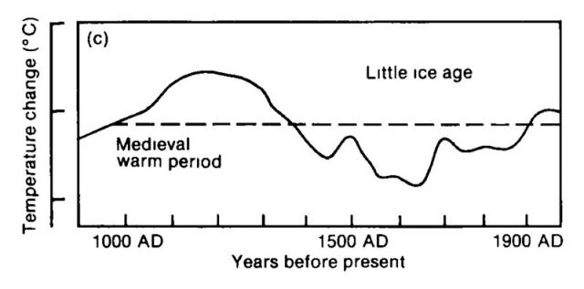
The United Nations commissioned a panel to study climate change in 1988. The Intergovernmental Panel on Climate Change IPCC was established. In 1990, the panel came out with an assessment of past world temperatures as shown below in Figure 5. The estimating of temperatures before the mid 1800s is difficult due to lack of records and thermometers before this time.
Figure 5. The First IPCC Assessment of World Temperatures, 800AD to the Present
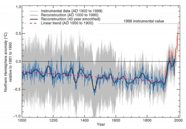
There is some argument that the Medieval Warm period and Little Ice Age were local events, however they clearly existed and profoundly affected much of the Northern Hemisphere. But more recent temperature IPCC plots lose them, as seen in Figure 6. below. The Medieval Warm Period enable the Vikings to settle in Greenland and red wine to be grown in England. When the Little Ice Age came, the Vikings had to leave and England has not been as warm since.
Figure 6. Third IPCC Temperature Assessment. Note the Medieval Warm Period and Little Ice Age Disappear. Because of the abrupt change in temperature after 1900, this graph has earned the moniker, The Hockey Stick Graph.
The controversy over the Hockey Stick graph is interesting reading and is the source for Figures 4-6.
In 2003, MacIntyre and McKitrick presented a detailed criticism of the IPCC 3rd Assessment’s Hockey Stick Graph in Figure 6 . I find their criticism compelling.
I could go on and on, but to summarize why I am a global warming skeptic:
- For the past decade the world has not gotten warmer
- Natural forces overwhelm CO2 as a driving force for climate change
- Sloppy science is behind the hockey stick graph
Please share your science- and fact-based comments.
Cheers,
Dr. Ron


